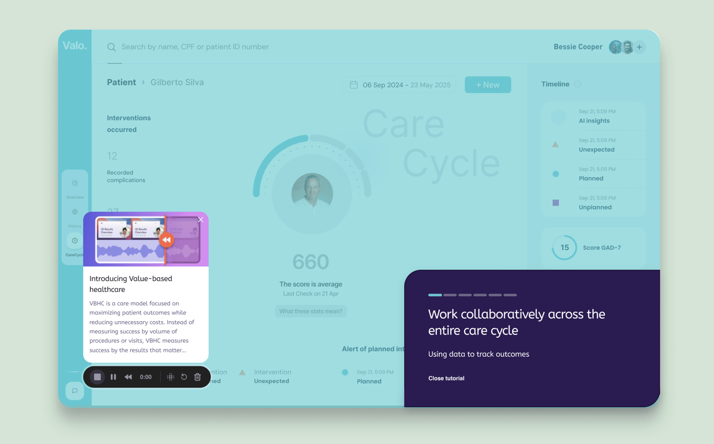
Tracking the care cycle
CASE
SaaS B2B
For Hospitals
Management
"This is one of the most complex service delivery".
Startup from scratch — Project developed together with a healthcare team, containing 2 responsible doctors and 2 nurses
What did we do?
Strategy and User research
Benchmarks
Information architecture
Prototype
Interface design
Micro interactions
Problem overview
☐ Who is using this dashboard, and what decisions are they making?
☐ How frequently will this dashboard be used?
☐ Which type of dashboard should I use?
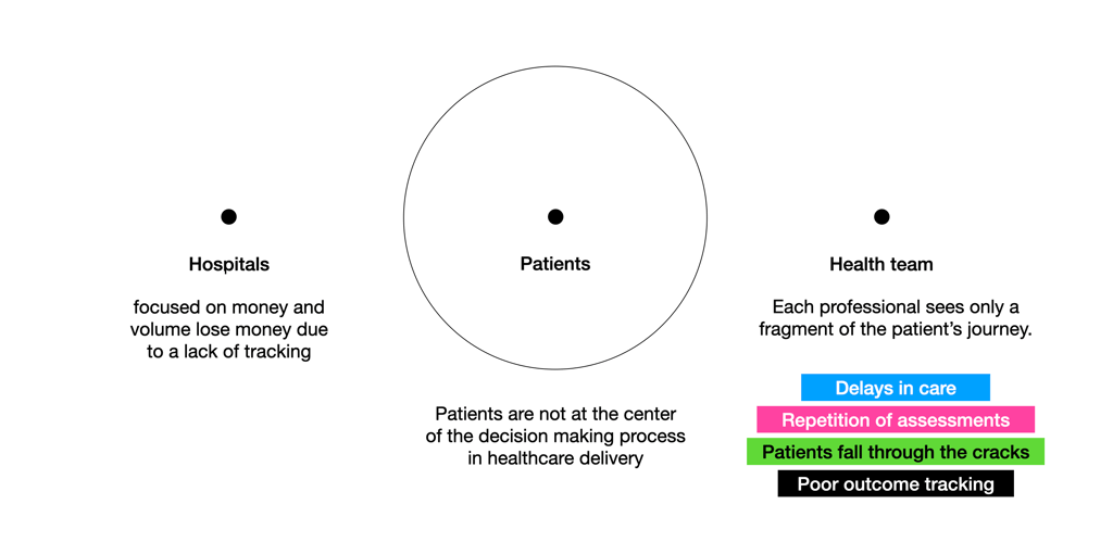
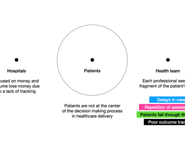
What are the barriers that we are going to break?
Managing
Organization
Measurable
The cherry on top
The insights phase (of the discovery process), I would say, is the icing on the cake of the UX process, because it's where the interpretation of the data leads to a unique and innovative design, without being guided by competitor benchmarks.
The 3 main insights:
The healthcare team complained about digital medical interfaces; they would prefer less raw data with a tech-driven look.
A narrative for the care cycle (for example, sometimes a treatment cycle can last a year and a half).
Simulation with a fake patient during onboarding as initial training, since there is a shift in the culture of how work is done today (less individual and more collaborative).
New work culture/trainning
3 key KPIs decided to track the care cycle, seeking actionable analysis
Measure the impact of the care cycle changes
Spot potential issues before they become major problems
Collaborate and share customer service cycle data across the organization
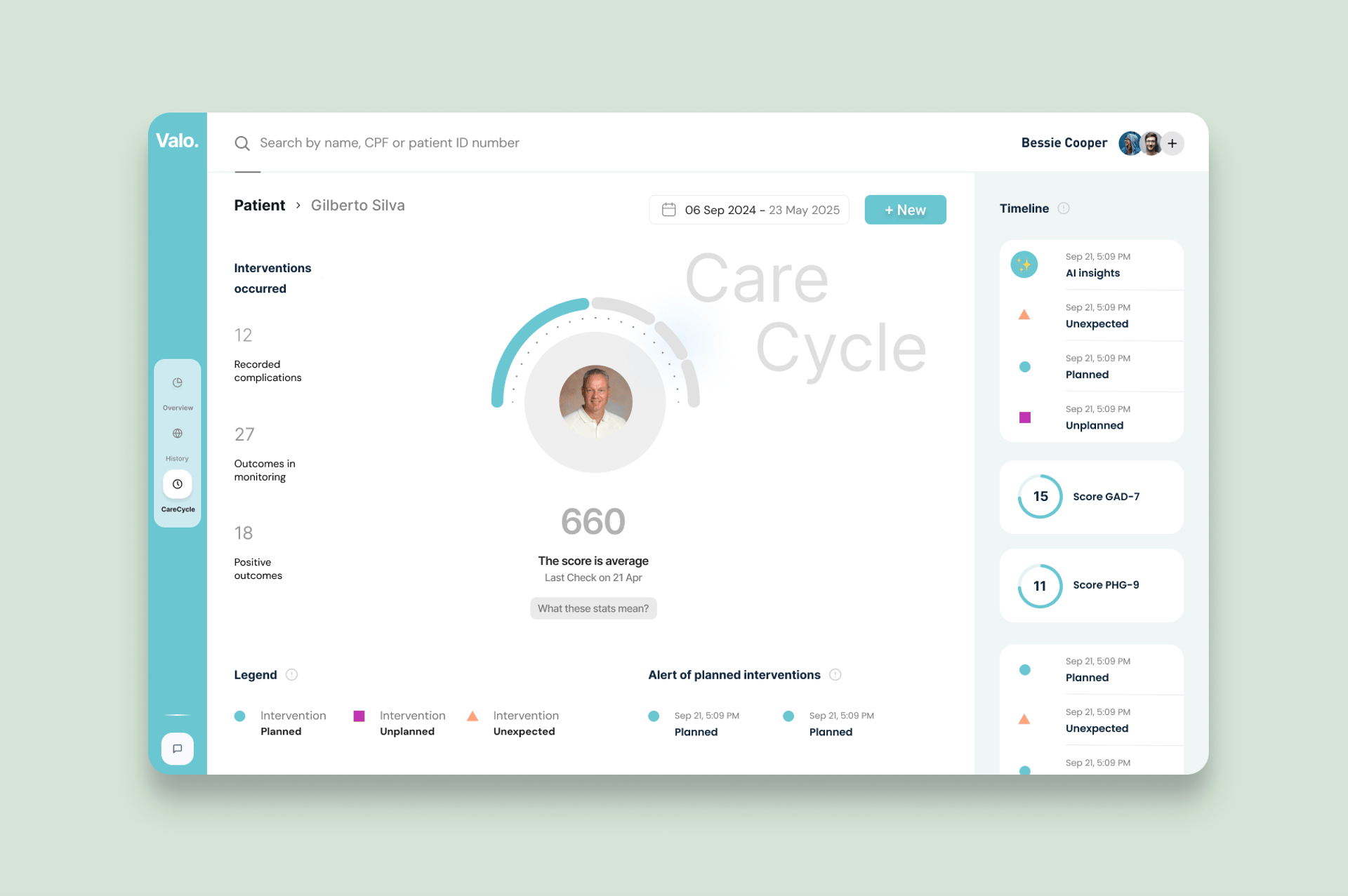
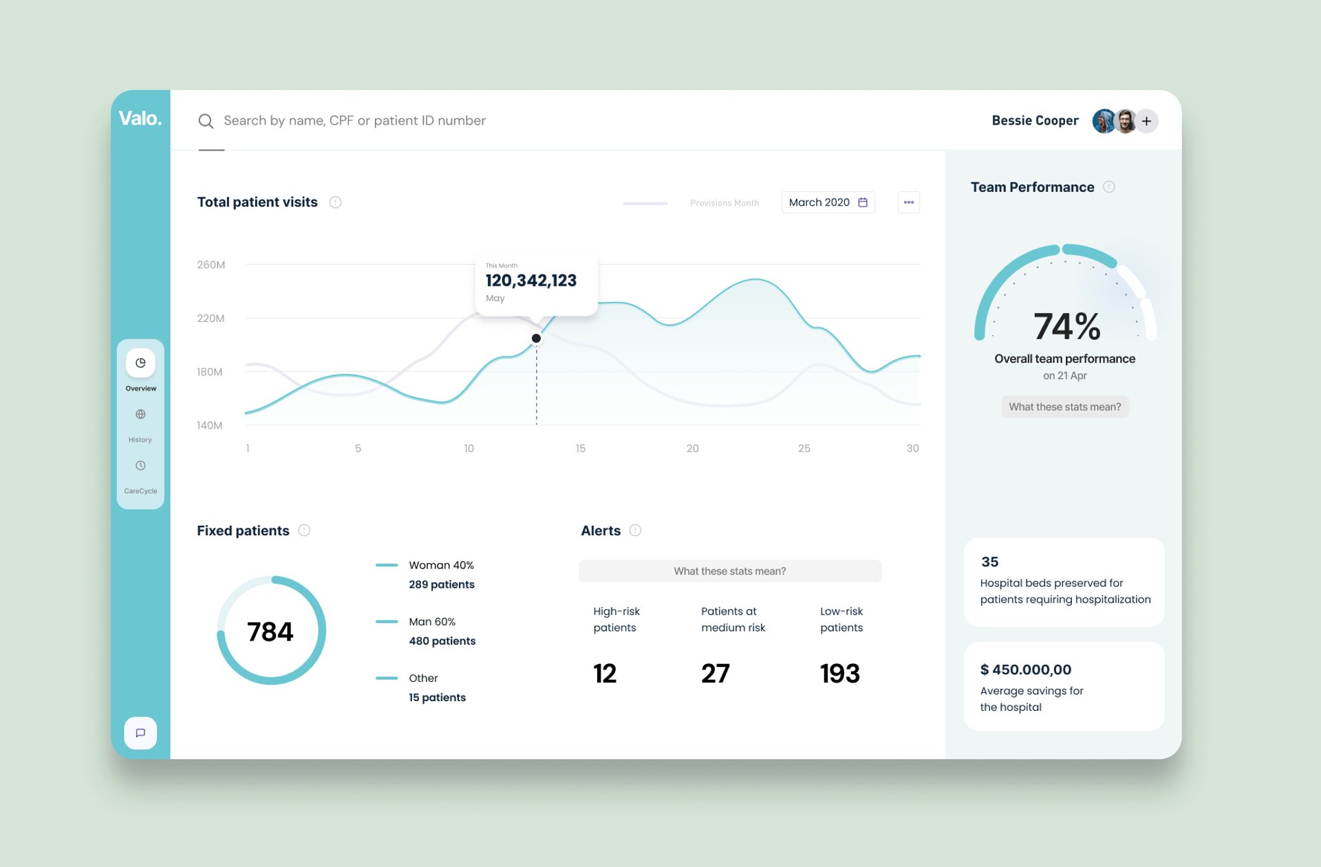
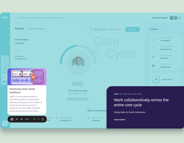
The timeline is a centerpiece and main differentiator
This becomes a story of the patient’s care journey.
Include:
GAD-7 and PHQ-9 longitudinal curves
Intervention markers (therapy, meds, assessments)
Team notes
Adherence and attendance
AI insights (sentiment, risk flags)
Outcome milestones
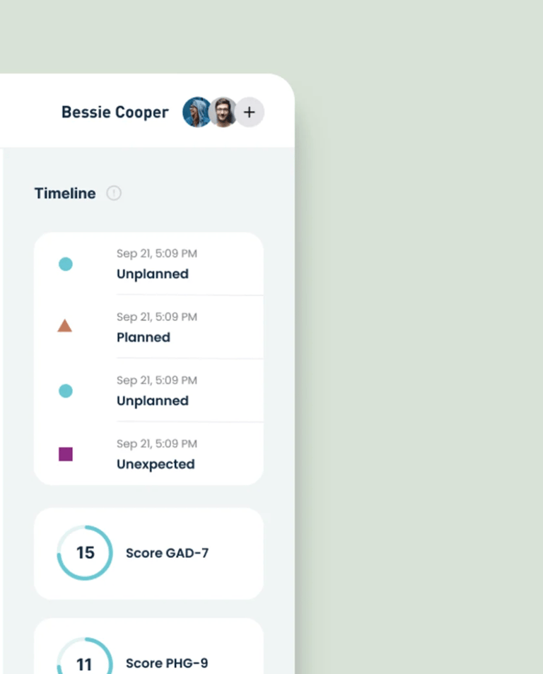
Score, what these stats mean?
This score is not a clinical diagnosis; it's a care-cycle performance indicator to support teams, not replace clinical judgment.
80–100
60–79
Improving, but risk factors remain
Healthy improvement + stable trajectory
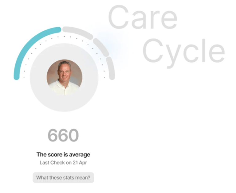
40–59
Unstable trajectory, needs team attention
<40
Deteriorating or high-risk
Dashboard UX
heuristics checklist
Clarity & Cognitive Load
KPIs fit in one-glance comprehension (< 5 seconds).
Actionability
Each alert is tied to a recommended next step.
Collaboration Support
Integrated messaging tied to timeline events.
Dashboard UX Heuristics Checklist
Clarity & Cognitive Load
KPIs fit in one-glance comprehension (< 5 seconds).
Actionability
Each alert is tied to a recommended next step.
Collaboration Support
Integrated messaging tied to timeline events.
Outcome data- driven
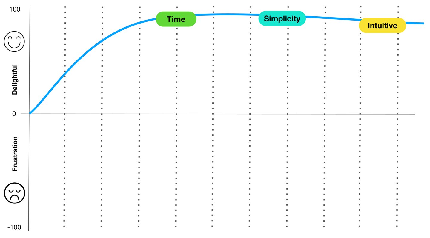
From the start of the project and throughout its entire duration, how do you measure User Experience (beyond product metrics)?
To help me with this, we applied the SUS (System Usability Scale) and the average was 92.
Time to Complete (TTC) — Time on Task | Number of Clicks / Steps per Task.
Metrics of SIMPLICITY (low friction) — Drop-off per step > This indicates if the flow is complex—the more people drop out, the less simple it is.
Metrics for INTUITIVENESS (low cognitive load) — First-attempt completion rate — Rate of users who completed the flow on their first attempt, without assistance.